
Colour is one of the quickest ways to create hierarchy, recognition and atmosphere. It is also surprisingly easy to rely on it too heavily.
A pale grey instruction on a slightly paler grey background may look beautifully understated on the designer's calibrated monitor. Fred, unfortunately, has opened it on a cheap laptop beside a window.
Real viewing conditions are imperfect
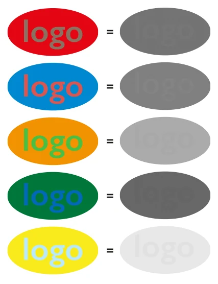
Contrast changes with the screen, printing process, ambient light and eyesight of the person looking at the work. This matters particularly when colour is carrying essential information.
- body text
- buttons and interactive controls
- form errors
- diagrams and graphs
- text over images
- disabled and active states
- small navigation elements
Formal accessibility standards provide useful minimum requirements, but passing a technical test should not be the only objective. Something can technically comply and still be unnecessarily difficult to see.
Contrast is part of hierarchy
The question is not simply whether everything is visible. Not everything should be equally prominent. Strong contrast can direct attention while softer contrast allows secondary information to recede.
The design should not need perfect laboratory conditions to communicate.
A useful test is to move away from the screen, reduce the brightness, look at the work on another device or print it on an ordinary office printer. Fred rarely carries a calibrated monitor. Neither does anybody else.
Have a branding problem worth solving?
Contact →